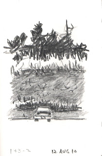
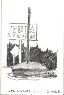
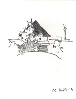
Got this idea from Ted Kautsky and an article in an art magazine. Ted showed me the importance of the three value system. The magazine article was about pitting two of those tones against one. One tone should be dominant--over half the drawing. The other two tones fill in the rest, with one of those taking over half that space. See further comments below.
Subscribe to:
Post Comments (Atom)


My new sketchbook, "Master's Touch 4x6," allows for drawings barely larger than a thumbnail sketch, but that enables me to do these kinds of three-toned drawings. Anything bigger and I would be scribbling all day and wearing out yet another pencil trying to fill the page, especially when the dominant tone is black.
ReplyDeleteThe Pencils for the tones, by the way, are 4B for the blacks, and HB for the grays. Derwent Sketching.
An interesting technique. I always enjoyed those times when I could break down a scene into a few simple tones - when multiple objects have been encompassed with a single outline, you know you're doing it right. Good car! Also, the tall, tall trees is what I remember of the south.
ReplyDelete